Mazopiya
Mazopiya is a health market that was formed back in 2011 with the goal of providing organic, health conscious options for anyone with or without food sensitivities. With such a unique storefront that offered a cafe, refresh bar, cooking classes, and Native American flavors, it was important to have a visual identity that leave onlookers wanting more. A new visual identity with certified fresh visuals and new campaigns focusing on unique food and drink, and in store offerings would be the basis behind an increase in store traffic and sales.
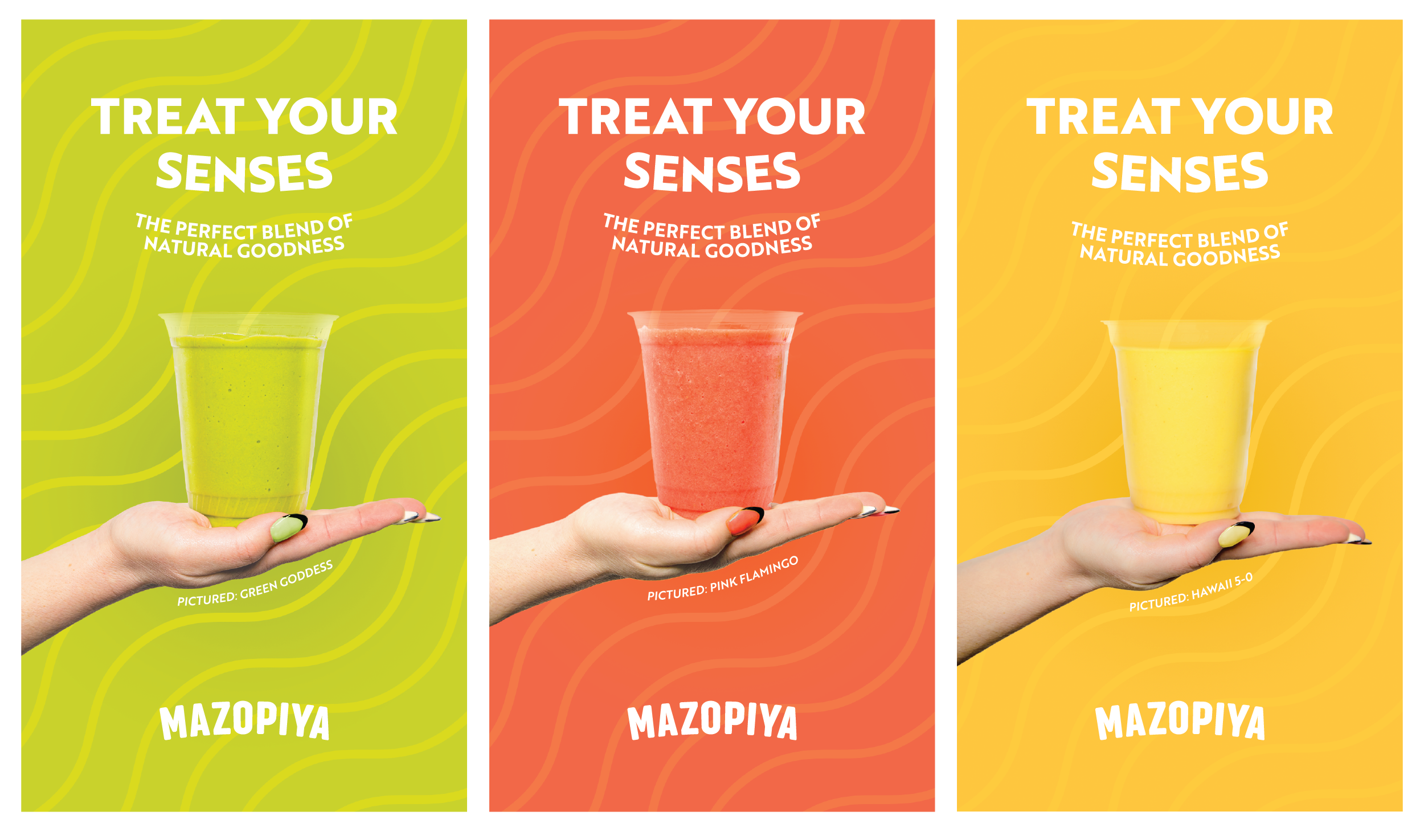
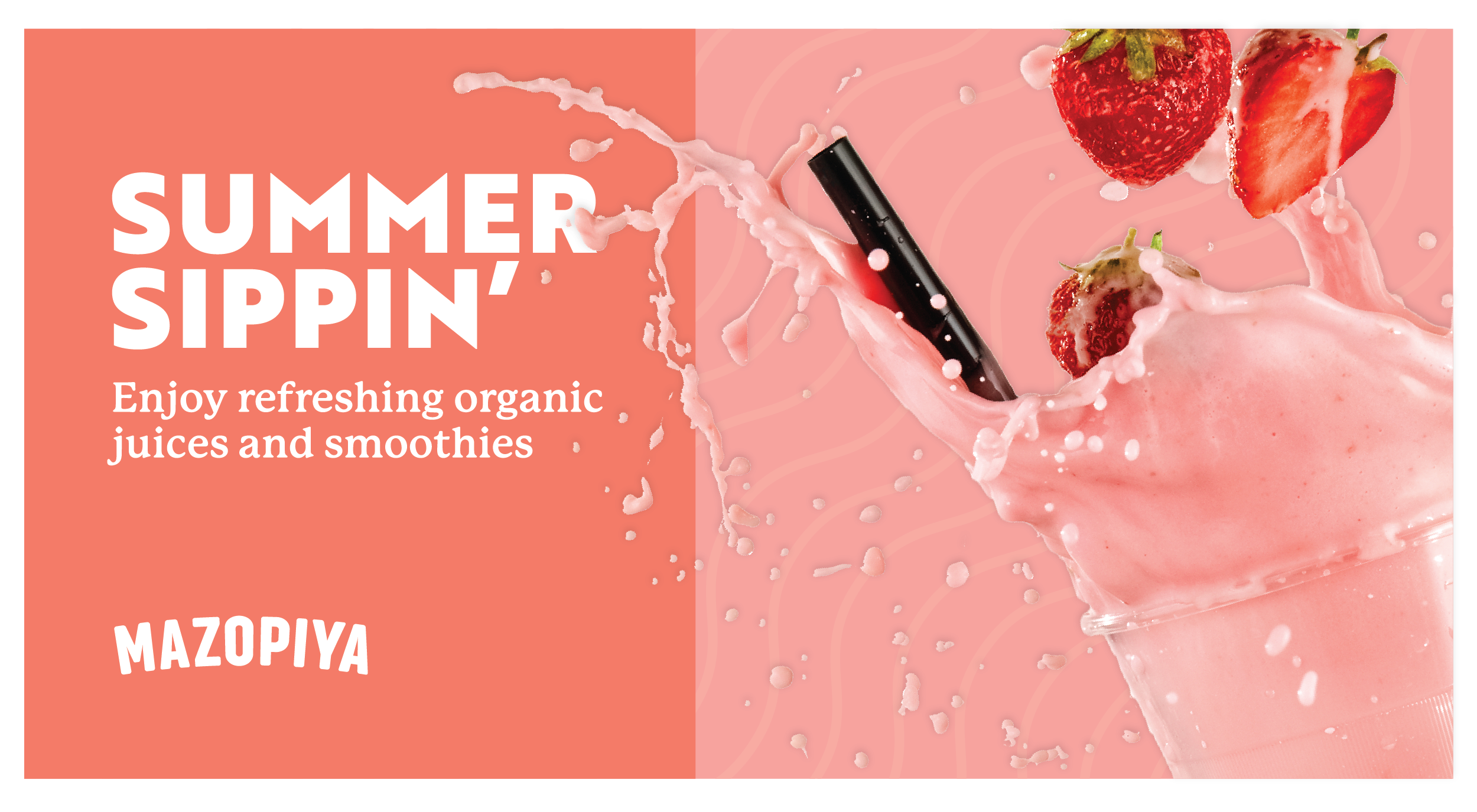
To help strengthen the brand, the logo was simplified by removing the tagline. The bland typeface for Mazopya was replaced with a typeface that instilled personality and flair. A new native inspired logo mark was introduced symbolizing a strong corn stalk. The new personality was pushed through social campaigns, digital displays, customer mailers, in store advertising, packaging, and more.
MAGUIRE WAS RESPONSIBLE FOR
Visual Identity
Brand Identity
Copywriting
Studio Photography Planning
Interior Design


