Elevate
Elevate cold pressed juice focuses on the before and after, promising that consuming their juice will take you from feeling downcast and elevate you to an enhanced state of mind.
Naturally, of course.
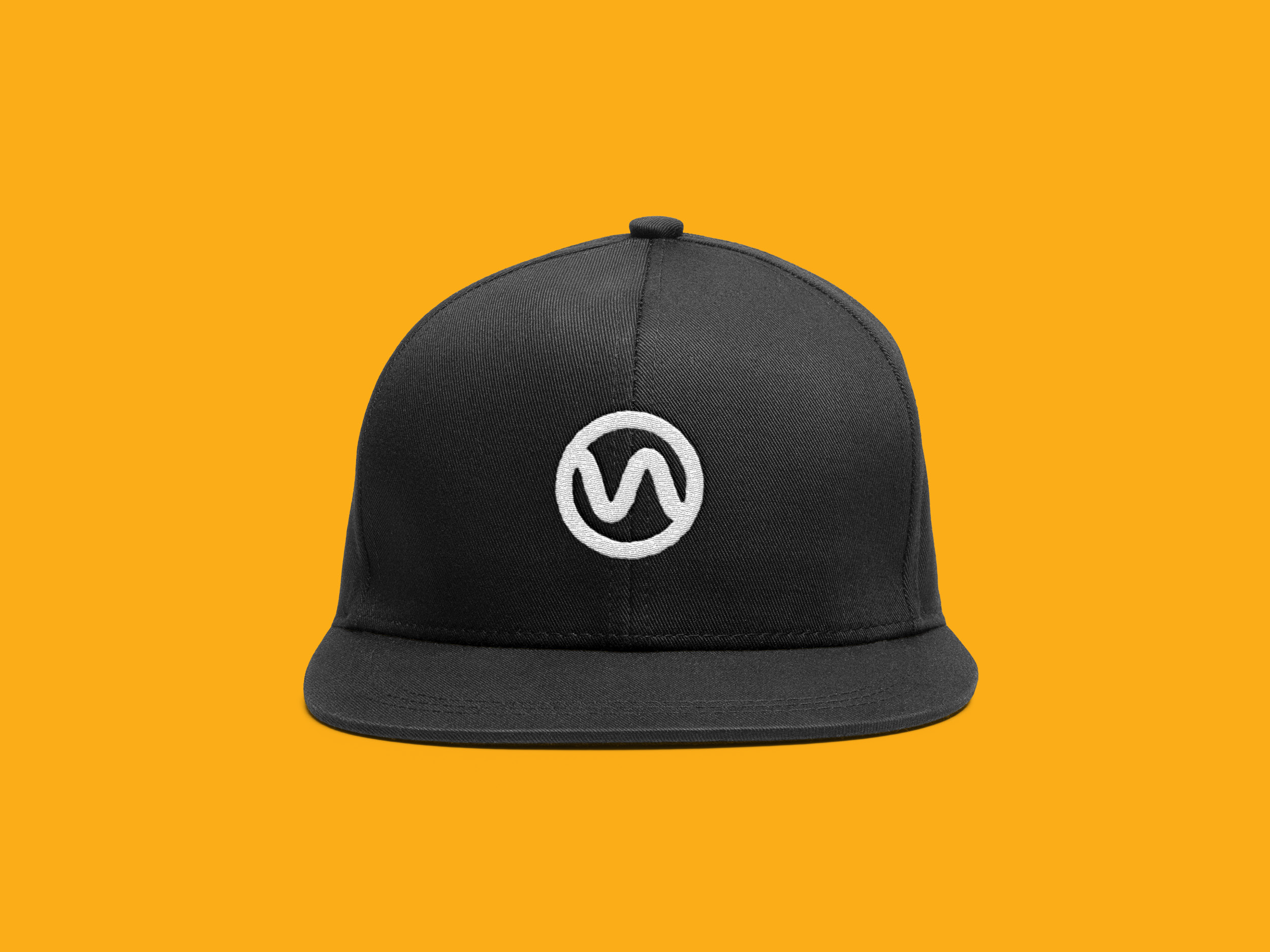
With the main idea of Elevate in mind, it was very important the logo would have direct ties to the idea of gaining a natural energy boost post consumption. This logo included a wave shape that is signifying the idea of a downward facing arrow transitioning to an upward facing arrow. Along with that this shape was also pulled from the unique letter pairing of “VA” in “ELEVATE”, helping tie not only the meaning of the word, but another visual to the core idea of the juice.
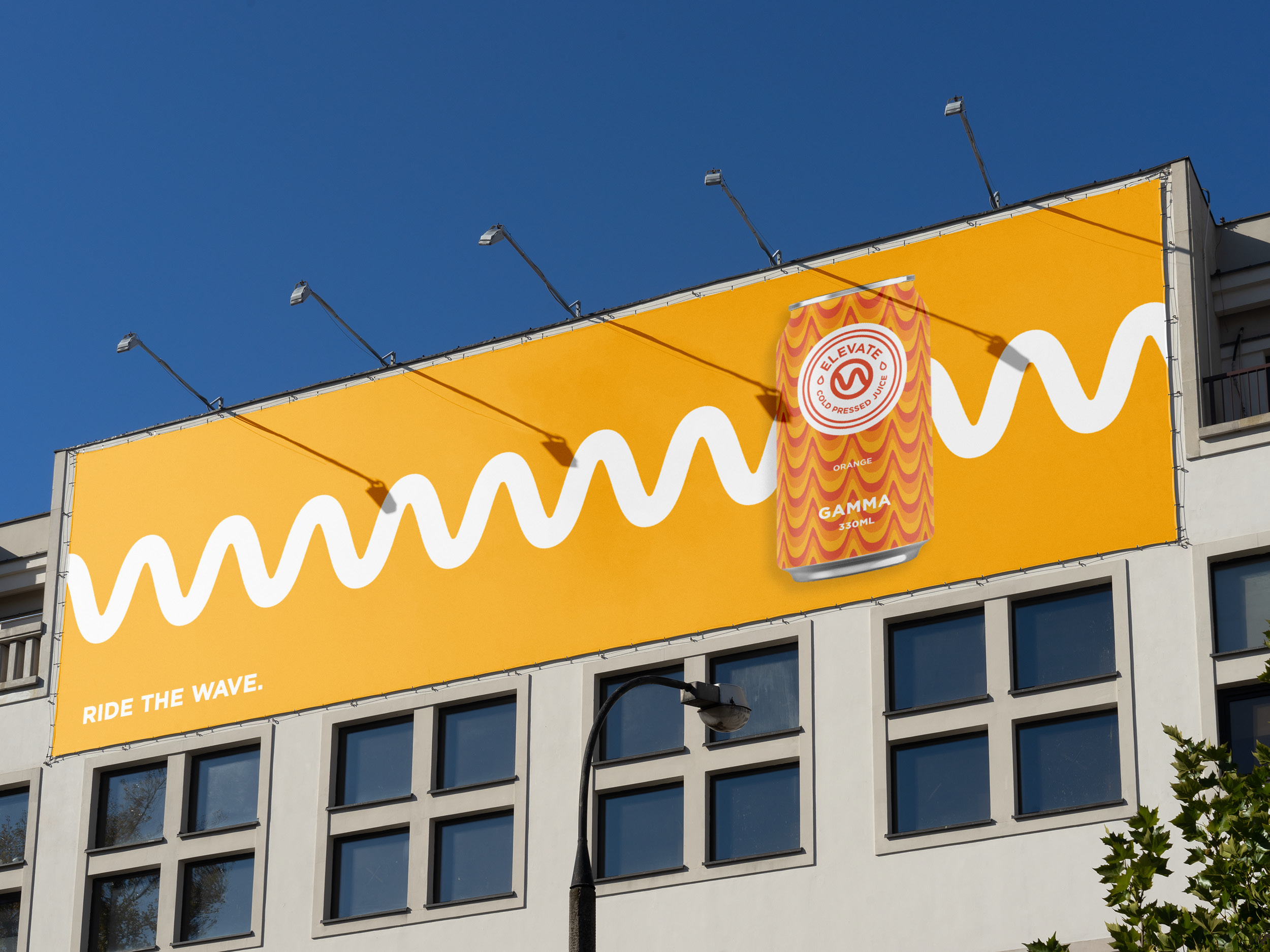
It doesn’t end there. With Elevate’s core idea revolving around energy, the logo was created to represent the idea of different frequencies in wavelengths corresponding to different amounts of energy. This direct connection to energy would help create an original brand and would certainly encourage consumers to “ride the wave.”
“Ride the wave” helped fuel the new organic look of Elevate cold pressed juice, which allowed the design to push the idea of energy and the “before and after” to whomever is in need of a pick-me-up throughout their nine-to-five day.
To even further reinforce that idea, it was important to have a color palette that could be used anywhere on anything and still would say the same thing, “pick me up and drink me.”
If a can could speak, why would it need to if it looked this goooood.
The Elevate cans would have no problem standing out on a shelf in your local grocery store. Beyond that it was important to have a campaign that would surely stick in the minds of whoever had the opportunity to look its way. Simplicity was a high priority behind creating something that would be memorable, so the solution was to have the straightforward slogan, and the idea of wave frequencies front and center to create a bold powerful message.


